University of Washington
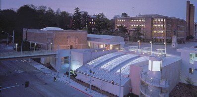
Henry Art Gallery Seattle, WA The contextual challenges posed by the renovation of and addition to the Henry Art Gallery not only afforded the opportunity to recast the 1926 Carl F. Gould building, a 10,000 square foot, two-story masonry structure, as the primary element of the west campus entry to the University of Washington, but in fact propelled the design and helped to define the program. Continue BackBut perhaps most important, the intervention visually separates the museum and addition from adjacent structures, affording a legitimate transition, a new sense of place, an expectant and enriched entry sequence and an integration of site, circulation and context.
In counterpoint to the original Henry, the new main gallery constitutes a memorable form to be re-experienced from within. The addition also acts as a carving away of a solid, revealing fragments that interact with the original Henry to re-site it as the asymmetrical—though primary—object in a new contextual frame, unifying the multiple architectural and site issues at the end of Campus Parkway.
Finally, the intervention is an architectural collage that unifies disparate elements in both contrapuntal and asymmetrical variations. The variations reestablish the primary site axis to Suzzallo Library, reconcile the vertical transition from the street to the plaza level and integrate the original Henry facade both with the new sculpture court and gallery entry and with the campus entry. As fragments, the forms imply but do not directly reveal their spaces. Thus anticipation, sequential revelation and memory become as crucial to the experience as the physical manifestation of the complex.
Associate Architect: Loschky Marquardt & Nesholm
Richard Andrews, Director
“[The] inversion of the expected order—descending to the largest, brightest, and most dramatic volume in the building— is the most compelling aspect of the design. To find this generously daylit and high-ceilinged space in the deepest reaches of the project is a revelation. Gwathmey’s dictum that one should experience a museum as a sequence of varied spaces, a kind of unfolding and revealing of artworks with a continuous sense of surprise, has been executed brilliantly.”
Justin Henderson in “Museum Architecture”, 1998


